The
Infographic
Project
The Infographic Project gives you a chance to explore the world of data visualization as a vital way of communicating and educating your audience.
There are wide range of infographic types including:
map
schematic
factoid/fun fact
timeline
decision tree
comparison
As a design challenge, this project may requires you to use:
photography
typography
design elements
graphs and charts
into a cohesive, clear and compelling work of design. To this end, a considerable amount of research needs to be spent gathering the best possible: layout, fonts, color schemes, photos . . . and statistics.
As a useful Illustrator workflow resource, be sure to download this amazing Ultimate Pizza Infographic. You can also get the font used here.
The big challenge of data visualization is to make the numbers understandable and compelling using the right chart or graph. To help you work with Illustrator’s graphing tools be sure to use this helpful chart reference document.
This project will also introduce the basics of Photoshop, this photo will help you get an understanding of cutting an image out from a background.
And for a set-by-step infographic workflow, check out this video series.
Assessment
As with all Pro Projects, keep in mind that your work will be assessed by:
Professionalism - Project is done "to spec", follows directions, and fulfills all requirements.
Craftsmanship - Project exhibits an admirable application of design principles, an aesthetic style, and use of app workflows.
Challenge - There is producible evidence that the final design underwent the entire design process and was significant challenging.
Originality - Project content is unique (not copied, derivative, a template, AI generated in part or whole, or a reproduction of a tutorial).
Note: Images referencing drug use, guns, violence, hate speech, etc. are not permitted.


Process
1. Communicate
Because you will be the one to select the topic for this project, you’ll need to give yourself a short questionnaire and come up with a design brief.
Here are the essentials:
What are your interests - and what part of your interests are you most excited about (the history, the activity itself, etc.)
What stats, images, comparisons, etc would make the most compelling infographic on your personal interest?
2. Research
Based on your design brief, visit the following websites and conduct some related searches:
Google (image search)
Dafont (be sure to use custom sample field)
Google Fonts (be sure use custom sample field)
Coolors (come up with a color scheme)
TextureLabs (great texture library and Ps tuts)
Behance (for layout and style inspiration)
The measure of things (useful visual comparison)
You’ll need to create 2 documents: a moodboard and a research log
Moodboard: As fonts, image, layouts, etc. resonates with you, screen grab them (CMD+Shift+4 on a Mac, Win + Shift + S on a PC). After you have at least 20 or more assets**, drop the collective images into gomoodboard.
*Make sure you do a “large” image search for higher-res photos. If you find something you really like, be sure to download the image not just a thumbnail.
Research Log: As you discover compelling info and stats, copy and paste this in information and the URL to the a word doc or google doc. You’ll need to cite your sources as a list of URLs at the bottom of your infographic.
3. Ideate
Based on your moodboard, grab your sketchbook and draw at least 4 possible layout solutions.
From these initial 4 solutions, selected one. Flip the page over and draw 4 new variations based on the initial solution you selected.
From this second round of 4, pick your top solution.
Before you fully commit, get some feedback from classmates, family, . . . anyone you can. Listen to learn - and be open to suggestions - you might come up with an even better solution with some outside feedback.
4. Formalize
Before you turn in this project - be sure to save 2 versions:
1 Source (for your portfolio) - with all fonts and guides still retained (“last-first-project-01.ai”).
2 Turn-in (for Canvas submission)- as a .jpg (“last-first-project-01.jpg”)
This will give you options to re-edit or share your work whenever you like. (For initial setup, see “Specs and Standards” below).
Specs and
Standards
Your infographic can take on one of two possible layouts:
A 13x19in poster for print
A 1200px wide X whatever length needed “scrolling” infographic targeting phones (note: font size - must be legible)
As with all course projects, keep in mind that your work will be assessed by:
6 or more design elements (graphics, maps, charts, etc.)
A clear title, body, and sources sections.
All illustration and icon work must be your own work.
Issues and
Guidlines

Given all the factors at play, the range of potentially great solutions for this project is enormous. With this in mind, below are some common issues and helpful guidelines to consider.
Show don’t tell. All stats should be made visual/graphical using icons, charts, etc. rather than a wall of numbers.

Graphs and numbers can be unclear (or overwhelming if there are too many). Make sure to use only the best of your data - and clearly state any takeaways from your information.
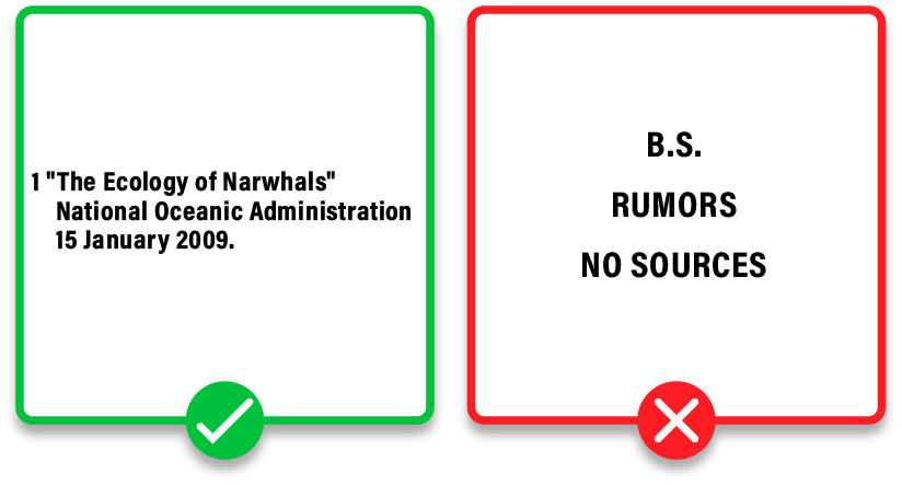
Include a sources section at the bottom. Make sure your info is accurate - and avoid just recycling another infographic's info.

Make sure the flow of information is clear and easy for your audience. Consider a Z flow for info blocks, use consistent dividers, and use consistent line angles.